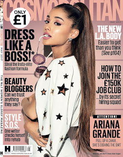
- Same continuos font throughout cover shows brand identity
- Various cover lines capitalised and in bold used to stand out and draw more attention to them
- Certain cover lines in different colours to stand out and look more aesthetically pleasing
Layout-
- Puff with the price in bold showing how cheap it is, a typical convention
- Hearst brand logo in bottom corner - brand identity
- Puff in bottom corner with a popular story on to catch readers attention as something they might enjoy
- Includes issue dateline and barcode
Use of language and images-
- Use of celebrity endorsement- Ariana grande being the main focus on the front cover- recognisable to younger generation
- Body positioning of model- eye contact- striking and rememberable image
- Use of prop, the sunglasses to draw attention to her face
- ‘ATTENTION’ an imperative forcing the reader to look and use of capitalisation draws more attention and creates a sense of importance and urgency
- ‘We’ personal pronoun creates a sense of inclusion and makes reader seem they share same opinions as the reader
- ‘Style Sos’ alliteration to suggest a fashion emergency and abbreviation to appear informal and relatable to audience
- Date line- typical convention
- ‘Dishing the dirt’ pun will appeal to younger target audience through humour


No comments:
Post a Comment