Tuesday, 20 September 2022
Blog progress
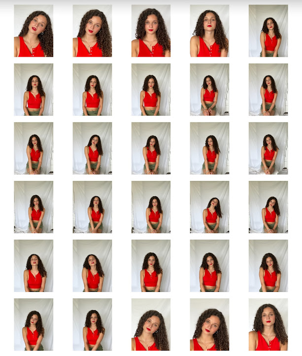
My 3 priorities for the weekend were to: changes the fonts and colours of cover lines on my magazines, create a sell line, and to do a few more photoshoots.
My most recent version of my first front cover after I’ve added a sell line and changed the font, size and colour of my cover lines. I also added the issue.
Wednesday, 14 September 2022
Tuesday, 13 September 2022
Textual Analysis: Elle
Typography-
- Typical Didot font consistent with the brand reinforcing brand identity
- Certain cover lines bolder and larger to draw attention of audience, especially as it contrasts against the darker background
- Referencing the star indicates audience should have the cultural competency to know who she is
Layout-
- Masthead at the top of page like most mainstream magazines, with the cover lines to the side of the main image
- Has a barcode, dateline and edition which are typical conventions of a magazine
Use of images and language-
- Strong striking mid shoot photo of Angelina with strong eye contact showing confidence and empowerment
- Use of direct mode of address
- Use of black and white makes it appear more serious
- Intertextuality with maleficent
- ‘Sexiest’ ‘healthiest’ and ‘best’ all strong superlatives that would appeal and catch attention of target audience
- ‘Exclusive’ makes it seem important and special, urging the reader to look through the story
- Low key lighting suggests professionalism
- Hand placement adds emphasis to the face and draws attention to that area
Textual analysis: Harpers Bazaar
Typography-
- Use of didot font on masthead- continuous throughout all front covers showing brand identity
- Harpers in a smaller font in masthead, not typical convention of a magazine
- Larger font for main cover line to draw attention to it
- Cover lines in white to contrast with background
Layout-
- Typical layout with masthead at top and main image with cover lines around the side
- Larger cover lines on top with the smaller cover lines underneath to show importance
- Doesn’t include barcode or issue subverting typical magazine conventions
Use of language and images-
- ‘Chamber of secrets’ is an intertextual link to Harry Potter and suggests mystery and suspicion to hook readers to find out more about it, especially if they’re Harry Potter fans. This is dependent on Stuart halls preferred reading theory
- ‘Nature’ suggests environmentally friendly and has good connotations which may appeal to a large majority of the audience
- Use of flowers and pastel colours gives an aesthetic look
- Close up eye contact shot of model and natural makeup palette links with the main cover line of nature also promoting confidence in your natural self and body positivity
- Flower used as a sign of femininity and strength
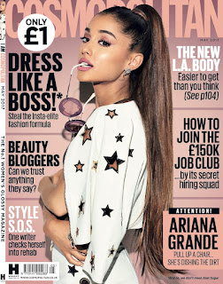
Textual Analysis: Cosmopolitan
- Same continuos font throughout cover shows brand identity
- Various cover lines capitalised and in bold used to stand out and draw more attention to them
- Certain cover lines in different colours to stand out and look more aesthetically pleasing
Layout-
- Puff with the price in bold showing how cheap it is, a typical convention
- Hearst brand logo in bottom corner - brand identity
- Puff in bottom corner with a popular story on to catch readers attention as something they might enjoy
- Includes issue dateline and barcode
Use of language and images-
- Use of celebrity endorsement- Ariana grande being the main focus on the front cover- recognisable to younger generation
- Body positioning of model- eye contact- striking and rememberable image
- Use of prop, the sunglasses to draw attention to her face
- ‘ATTENTION’ an imperative forcing the reader to look and use of capitalisation draws more attention and creates a sense of importance and urgency
- ‘We’ personal pronoun creates a sense of inclusion and makes reader seem they share same opinions as the reader
- ‘Style Sos’ alliteration to suggest a fashion emergency and abbreviation to appear informal and relatable to audience
- Date line- typical convention
- ‘Dishing the dirt’ pun will appeal to younger target audience through humour
Subscribe to:
Comments (Atom)
-
1663- The earliest example of magazines was Erbauliche Monaths Unterredugan, a literary and philosophy magazine, launched in Germany . 1731-...


